Python Graph Gallery (Part 1)
This essay is going to summarise the python scripts of common graphs in data exploration. The sample data used here are Boston House Data (sklearn.datasets.load_boston())and Singapore PSI data. We will cover the following groups of graph:
- line graphs
- bar graphs
- dot graphs
- area graphs
All the scripts are available: https://github.com/beverly0005/graph-gallery
Line Graphs
We are going to provide scripts for 3 types of line graphs: standard graph, time trend, density curve. Before going to detailed graphs, let’s get familiar with the following options.


- Standard graph
There are a number of common options. They should be applicable to other groups of graphs:
- figsize
- linewidth, linecolor, linetype
- xlabel, xtick, ylabel, ytick
- fontsize, fontfamily
- xlim, ylim
- legend
- grid
- background color
- highlight points
- Add: line, dot, line segment, text or other shape
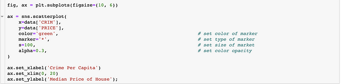
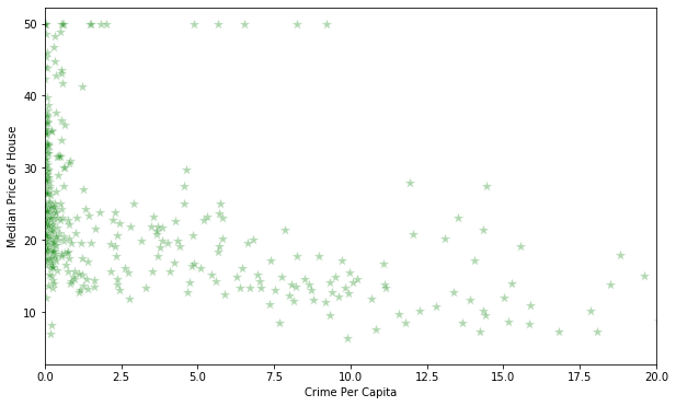
Figure: What is the relationship between house price and crime rate?


2. Time Trend
Figure: What is the trend of PSI over time

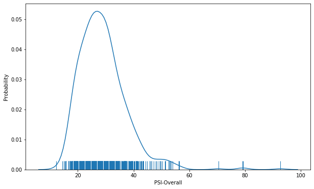
3. Density Curve
Figure: What is the distribution of PSI
Bar Graphs
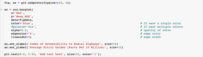
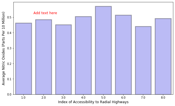
- Standard Graph
Figure: What is the average NOX regarding different accessibility to road
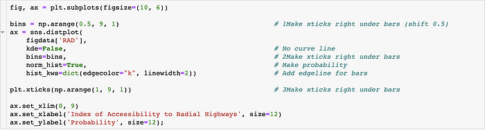
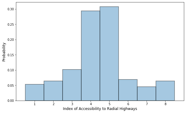
2. Histogram
Figure: What is the distribution of accessibility to road
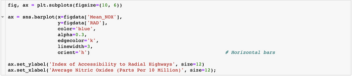
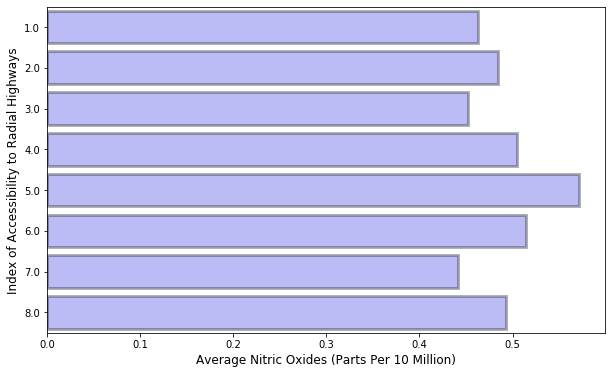
3. Horizontal Bar
Figure: What is the average NOX regarding different accessibility to road
Dot Graphs
- Standard Graph
Figure: What is the relationship between Price and Crime per capita
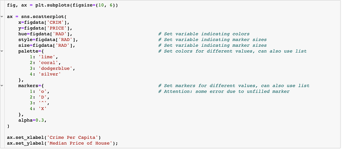
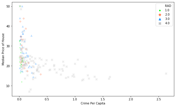
2. Scatter wrt. Category
Figure: What is the relationship between house price and crime rate for different accessibility to road
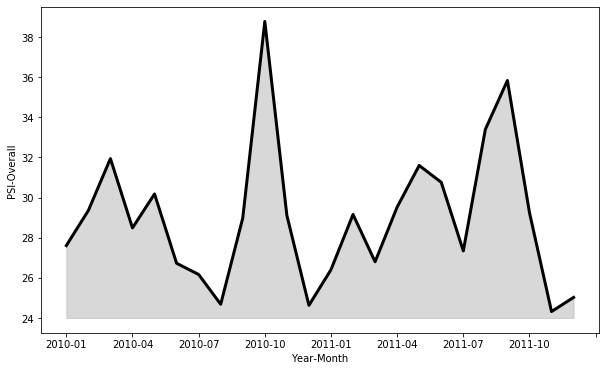
Area Graphs
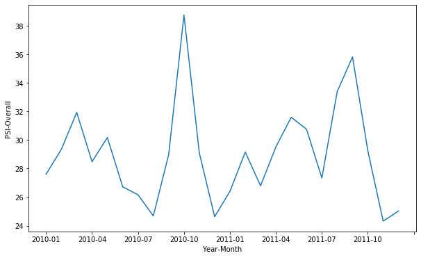
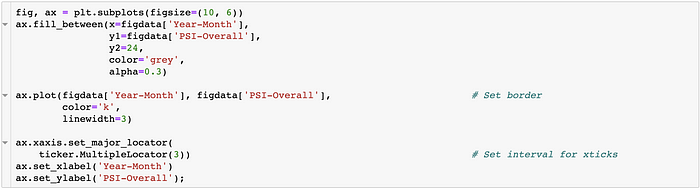
- Standard Graph
Figure: What is the trend of PSI over time
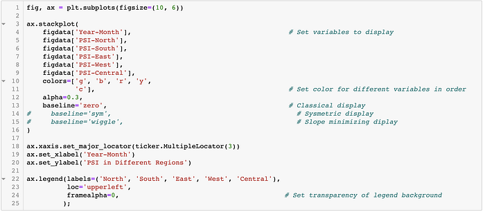
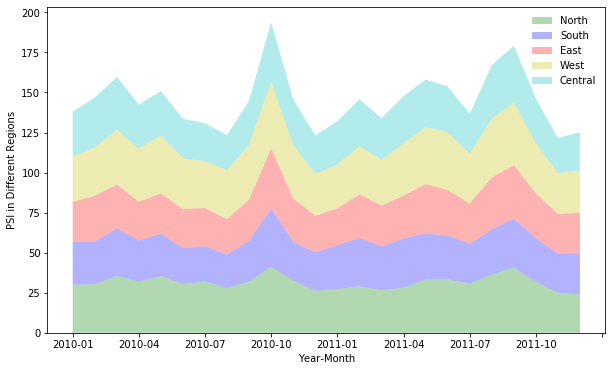
2. Stacked Area Plot
Figure: What is the trend of PSI over time for different regions